The Other "The Empty Nest Blueprint" Cover
It’s one thing to write 80,000 words, but it’s a completely different experience to see the contents of your book realized through a cover. Choosing a cover design was both a hard and a ‘this is real’ moment for me.
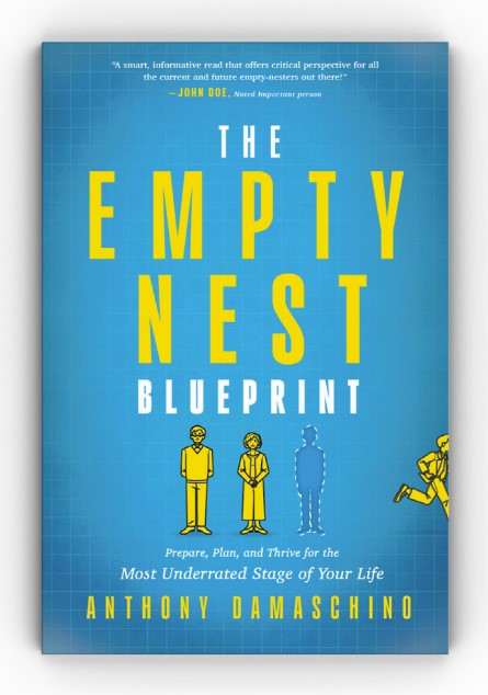
The cover you see in this blog was the runner-up cover for "The Empty Nest Blueprint." I loved the originality of this cover design: the child leaving the cover, the missing person, and the choice of colors. But, as we all know, art is subjective.
Questions that came up upon review were, why is the boy running? Why is it a boy and not a girl? What about the single, same-sex, or other couple variations? I quickly realized that when visually using people as an example you can unintentionally exclude others. I even had one friend ask, “Is the man running away because he is having an affair?”
One point of view is that a cover that elicits questions is good. The cover makes people think. There is movement, action, and questions. In the end, there were just a few too many questions and I felt a cover that screamed EMPTY NEST would be best. My current cover with the feathers, a torn-away blueprint, and an implied nest emerged victorious. This post is my tribute to the second-place cover which was also created by George Stevens at G Sharp Design. What do you think?
